
Netflix - Quizflix
It is a feature that improves the content selection on Netflix, adapting the recommendations to the user's current context according to his or her mood, tastes and the tastes of their companions.
Achievements
Research on content searching time on streaming platforms.
Definition of the user flow for the new feature.
Prototyping
Microcopy writing.
Selection of visual content and storytelling.
Table of contents
Spanish
Language
Problem
Netflix offers an extensive catalogue of films, series, and documentaries. However, as the amount of content and categories continues to grow, users find it increasingly difficult to navigate and find content that aligns with their preferences and interests.
The infinite scrolling, continuous carousels, and sheer variety are in many cases overwhelming.
If we add to the situation the lack of personalized recommendations, this leads to great frustration among users who are looking for a quick and easy way to discover new content.
Project setup
The product covers a wide range of people of almost any age. The common factor in all of them is that they use or are interested in using streaming platforms (preferably Netflix).
Target audience
Team setup
In this case, the team consisted of only 5 designers. Because it is a fictional project, part of the UX/UI design training.
My role
I was involved in all phases of the project, from research to prototyping and testing, but my main focus was on content design, definition of the narrative, selection of images according to the storytelling, microcopy and definition of User Personas and User Journeys.
The brand
Netflix is a globally known streaming content company. Its branding recreates the colours of movie theatres and its tone is informal, conversational and humorous, inviting users to enjoy the platform in their leisure time.
Research
The entire team conducted a desk research, focusing on the average amount of time users spend searching for content.
And we continued to get to know our users through 30 face-to-face interviews and a survey in which we collected 135 responses.
We found out that 80% did not come to the platform with a clear idea of what they wanted to watch, 50% took an average of 15 minutes to choose content - even longer if they were accompanied - and the factors that most affected their decision were their mood and their preference of film genre.
User research
Benchmark
After analyzing the apps of HBO Max, Disney+, Filmin, and Prime Video, with an emphasis on their content recommenders, we discovered that the most complete recommender was Filmin's. It not only classifies by categories, by decades, by countries, etc., but also has a filter based on mood and a three-question test to refine the recommendation even more.
User definition
To motivate team empathy and bring humanity to the data collected, I defined two user personas with their respective journeys through the platform.


User personas
Mario Fernández, a 34-year-old film lover with diverse tastes. Despite his love of movies, Mario struggles to find the time to make a decision about what to watch next and feels overwhelmed by the sheer amount and variety of content available on the platform.
Julia Garrido, a 22-year-old who enjoys watching Netflix with her partner or friends. Although she loves watching movies in company, she often feels frustrated that they can't agree on a show or movie that everyone likes.
User journeys
When defining the journeys, I not only took into account the characters' personalities and general frustrations, but also their context: what time is it? where are they? with whom?
In Mario's case, he logs in after work, when he gets home and after a long time searching, he gets tired of searching and abandons the application.


Julia starts off very excited, it's a Saturday night, she's with her boyfriend and they've got pizza. After looking for a recommendation that takes into account both of their tastes, they end up watching a film they have already seen countless times and eating cold pizza.


User flow and prototyping
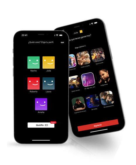
Access to the new feature is located on the Netflix profiles login page. There we define the flow, in which the user answers three questions and, as a bonus, if they don't agree with any of the three options offered, a roulette game can be played to help them make their final selection.
User flow
Prototyping
Staying true to Netflix's style guide, we kept the colours, typography and format of the images.
We knew we wanted to make the user's decision easier, so we included only one question per screen, avoiding: overwhelming them with too many options that would force them to scroll down unnecessarily; and keeping the selection process too long by having the answers spread across multiple screens.
As for the user interface format, we came up with some options, such as using chips, but they were very different from Netflix's style, which is very visual and dynamic. Finally, while browsing the original Netflix App, we found a section of games presented in small square cards, and we decided to use that format, as it included an image and a title, and they were small enough to allow us to include up to 12 options if necessary.


UX Writing
Following Netflix's brand voice - which is informal and fun, very conversational - I defined the microcopy using colloquial expressions in Spanish, making the section more attractive.
If this feature were to be taken to other countries, it would be necessary to adapt the text to the local language.
Voice and localization
Regarding the answer options, we used many colloquial expressions and puns. For example, in the question "choose a category", the text of the options read:
Instead of "I want to watch a drama", it would say "I want to cry my eyes out".
For "I want to watch a comedy", we chose "I want to die of laughter".
"I want to see something romantic" became "I want to fall in love".
For "I want to watch something philosophical", we used "I want to rack my brain".
In the question "Which characters would you like to see today?", I included casual and colloquial words and expressions such as: "geeks" for everything related to comics, superheroes, etc "outlaws" instead of "criminals" "Professionals" for everything related to the life of doctors, lawyers, politicians, etc.


When defining the three questions in the questionnaire, my aim was to respect the mood of the users and also to make it easier for them to choose their preferred genre. However, the team realised that many genres are directly related to mood, so it didn't make sense to ask both questions. For example, someone who is feeling happy and wants to have fun will probably choose a comedy and will not consider watching a drama or a horror film. We confirmed this by asking guerrilla questions to several users.
The three questions I finally defined for the questionnaire were:
Which format do you prefer today? Movie or series.
What do you feel like doing today? crying, laughing, singing, etc.
What type of character do you want to watch today? Animated, fantasy, historical, etc.
UX Writing
Storytelling with images
Another thing I defined was the visual storytelling of the app. It was important to find the images that best conveyed the message we needed to share. For the categories and character selection, I looked for images with strong emotions and an easy composition to make them understandable for the user on such a small scale. For the homepage, I selected gifs and memes to make a short storyboard that explained the new feature in a very simple and visual way, keeping the voice and identity of the brand.
Results
To test the effectiveness of the product, we conducted user tests at two different points in time:
When defining the first wireframes, to check if users easily understood the complete flow of the feature.
And at the final prototyping in high fidelity. In this case we assigned them a specific mission and defined a scenario to test, as realistically as possible, the usability of the product.
The result in both cases was mostly positive, the people who participated insisted that if the feature was real, they would use it very often and that they found it accessible and easy to use.
However, we also learned that it needed some adjustments, such as enlarging the font size, because many people commented that text was difficult to read.
Testing
Future steps
If we had the chance, these are some of the features we would include in the platform, to enhance, most of all, its socialization:
We would include personalised playlists, similar to Spotify where the user can categorise the content as they see fit.
We would also add an option to follow other users and share their playlists, improving socialization.
And in case of potential decision-making roadblocks, we would include a "Request a recommendation" button that would instantly connect with social networks and post an Instagram story to request urgent recommendations from friends.